From alliant's first design system to everything it now powers.
alliant's products and services, used by both its internal teams and its clients, had each grown their own look, with no shared design language. I built the one they all run on now. v1 pulled the existing products and services together; after the rebrand, v2 carried the new brand across all of them. This case study covers both.
- Role
- Founding Designer
- Timeline
- August 2024 to Present
- Scope
- Design system · Brand · Component library · Product UI
Standardizing what already existed
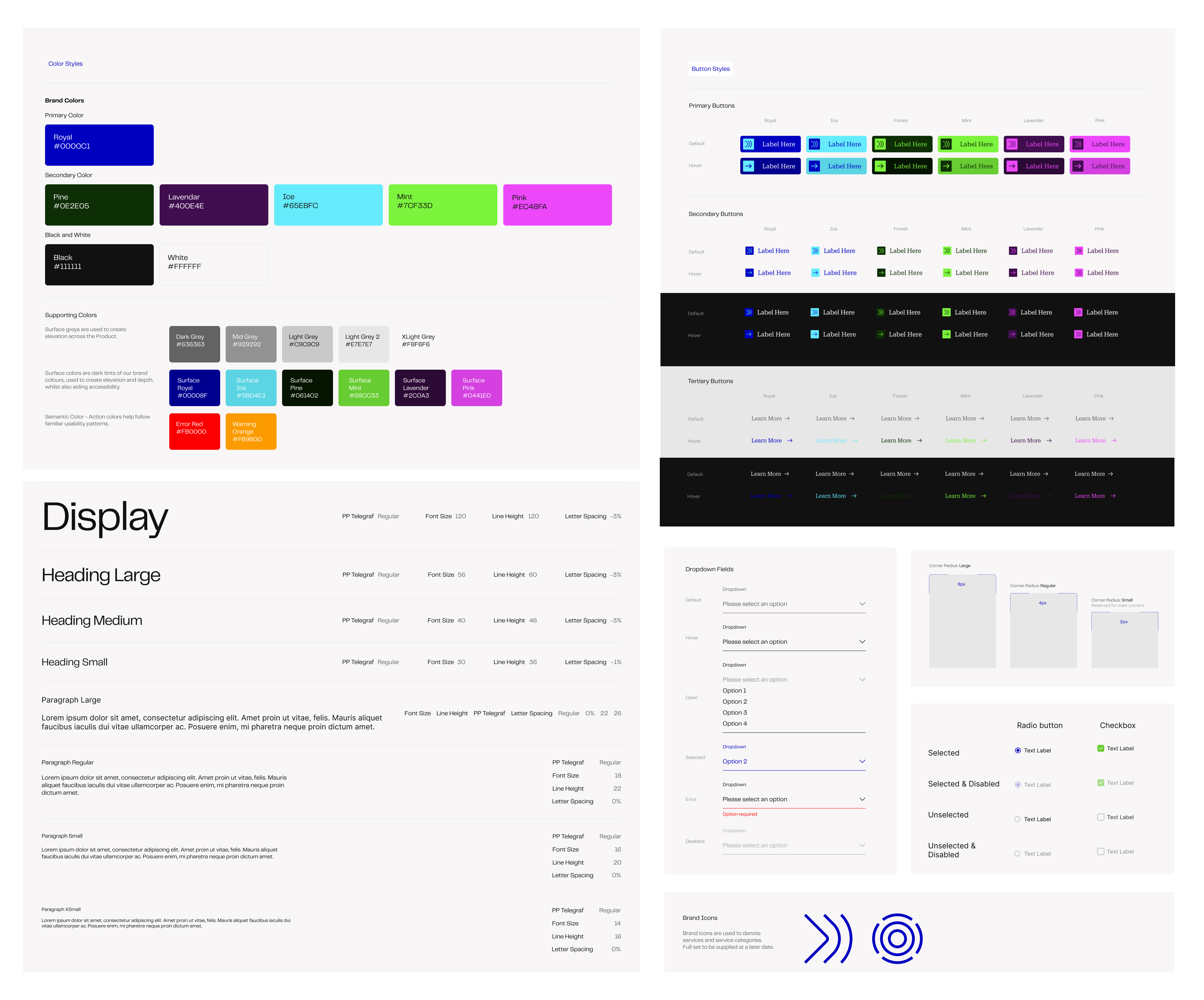
I went through the inventory of products and services we offer, to both our internal teams and our clients, and looked at how each one handled the basics. The same primary button showed up in about six different styles. Tables and form fields were just as inconsistent. We do a lot of automation work, so there were dashboards and document-processing screens everywhere, and each one used its own colors and font. Poppins was our brand font, but almost nothing actually used it. None of it shared a consistent look.
Version 1 was about consistency, not a rebrand.
I made one system out of what already existed.
This version was about bringing consistency across the brand so we could reuse what we already had, not invent a new brand image. I streamlined the existing visuals into one system everyone could pull from:
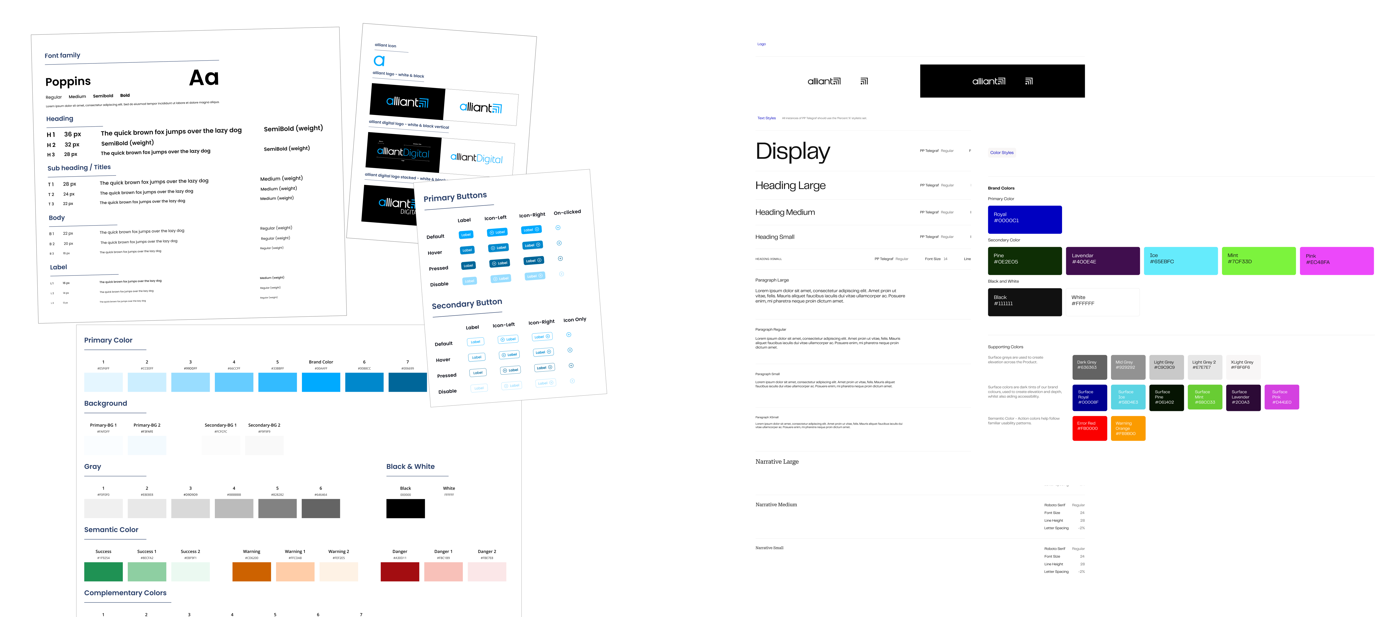
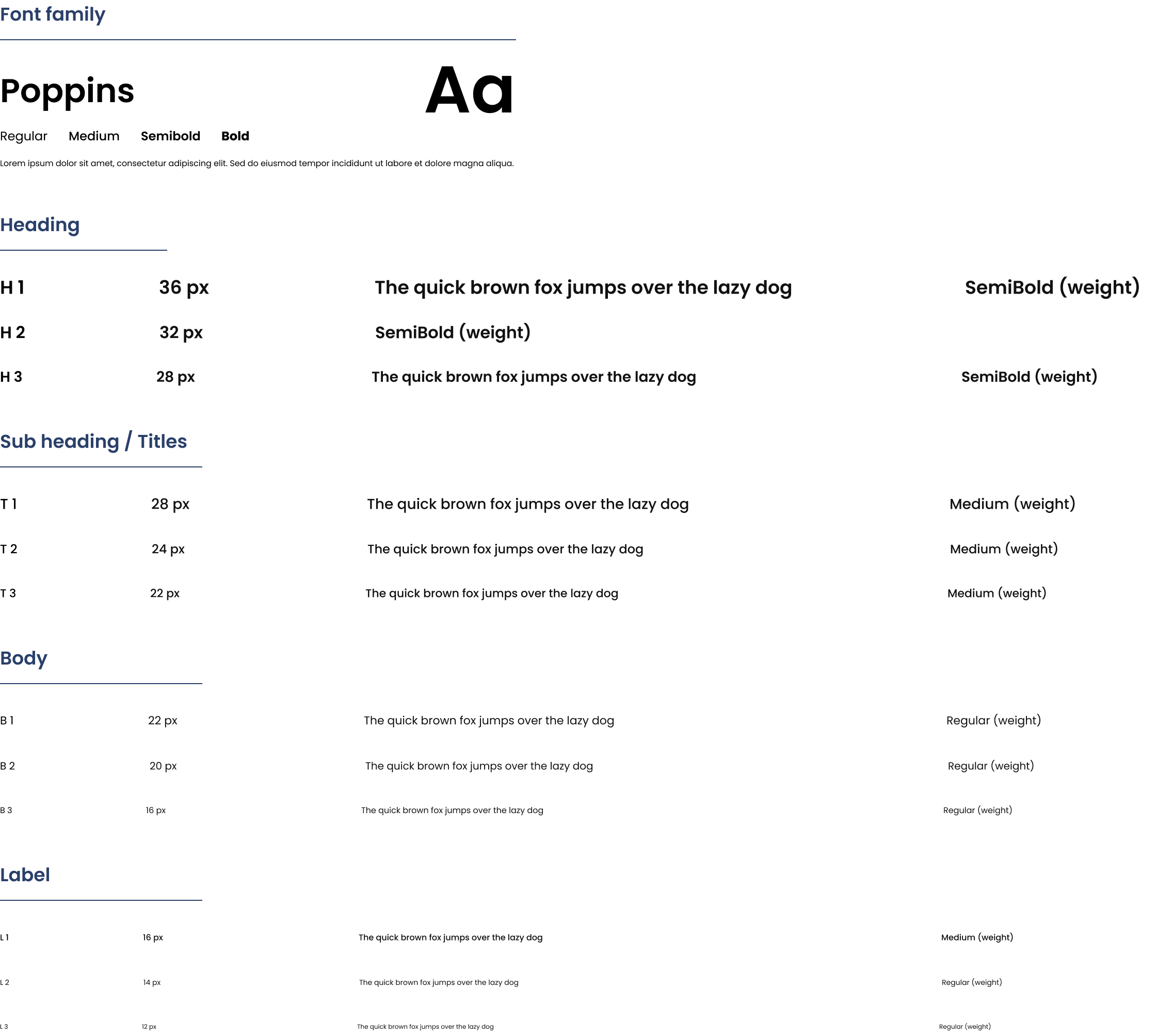
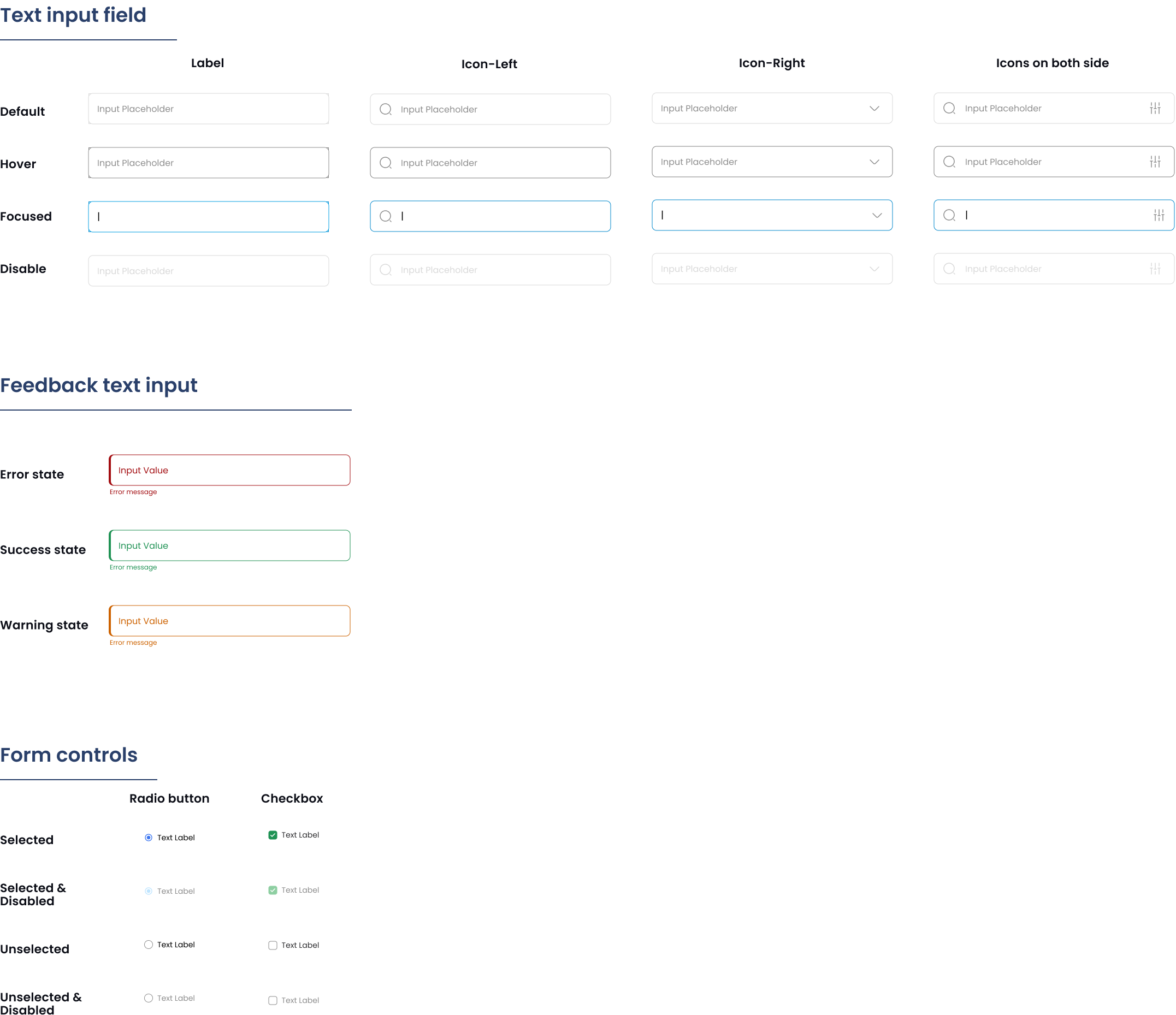
- Text: the scattered type guidelines became one set of styles, with Poppins, the brand font, applied consistently everywhere.
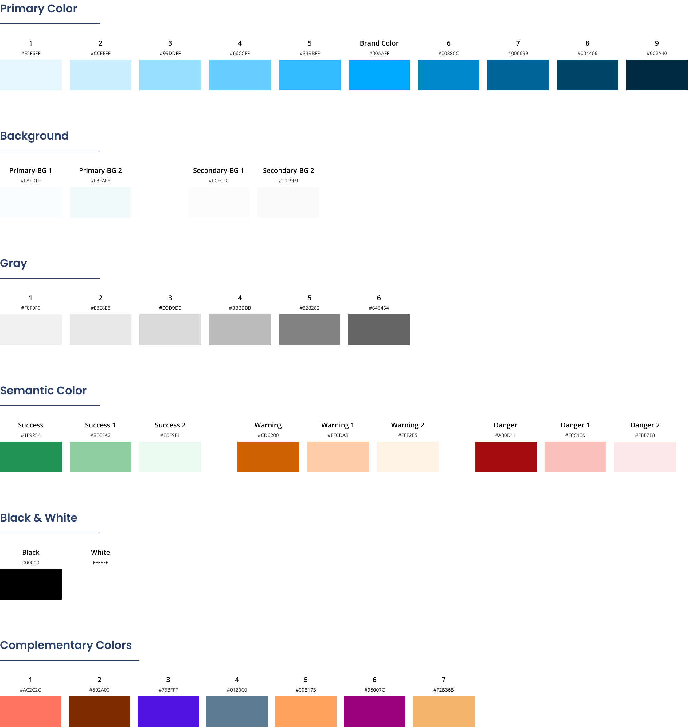
- Color: I kept the existing brand colors and organized them into a standardized palette, so the same colors read consistently across every site and service.
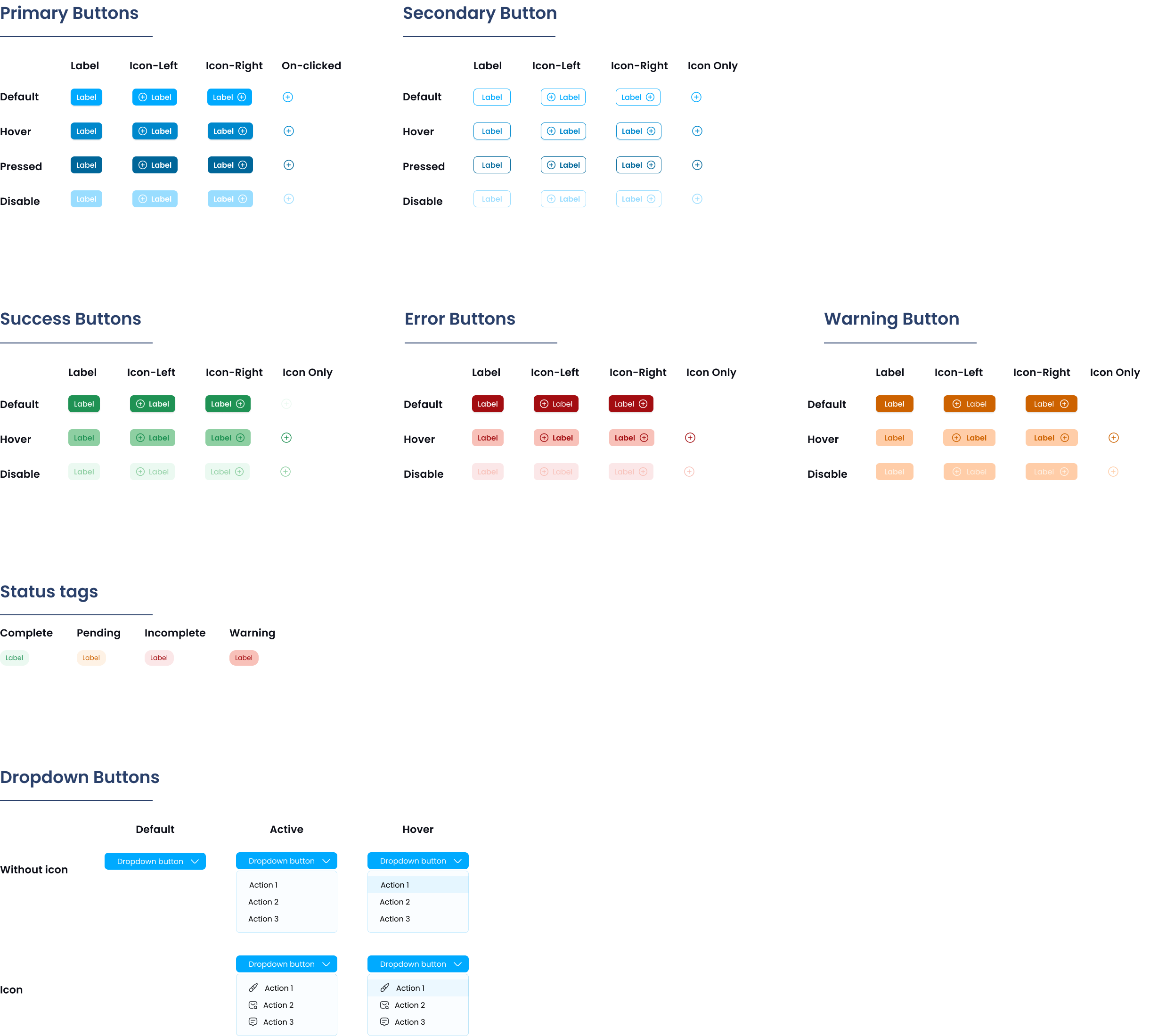
- Components: the parts every screen kept rebuilding, buttons, form fields, tables, became one shared version instead of six.
The components every team could reuse.
The standardized primitives, each one a single source of truth for every product.
And the screens they became.
Examples of how the brand system shows up in real products and internal tools, built from the components I created on it: cards, data tables, graphs in complementary colors, icons, buttons, and forms.
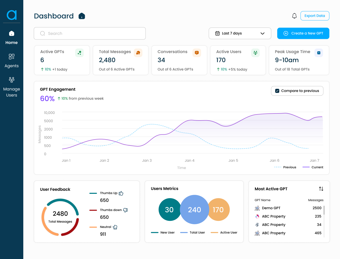 Designs modified · NDA
 Designs modified · NDA
Creating something new for the rebrand
v2 was a positioning move, not a refresh. It was how we positioned alliant as an industry leader.
By 2025, alliant had outgrown the brand it was built on. We were serving more clients, reaching a more global audience, and evolving with the tech and AI boom, but the brand still looked like the services firm we started as. The rebrand was a deliberate move to position alliant as a leader in its space, not a coat of paint.
What we wanted the brand to stand for.
Before any color or type, we aligned on what the brand had to do. Four things shaped every decision after.
01 · Global
Global, not regional
We serve clients across the world, so the brand had to read as international and credible in any market.
02 · Tech-forward
Visibly tech-forward
We had moved from services into agentic automation and AI. The brand needed to look like it leads that shift, not follows it.
03 · Client-first
In service of our clients
We are a service company at heart, connecting clients with the people and tools that serve them. The brand centers on them, not on us.
04 · Bold
Bright and bold
A confident, vivid presence that stands out, the look of a company claiming a leadership position.
Then I built the new design system around it.
A new color palette, a fuller type system, and components rebuilt on top, all documented so any team could use them.
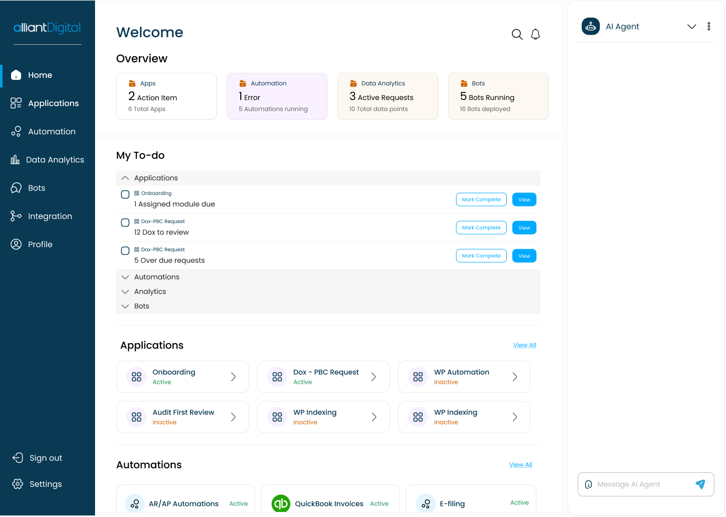
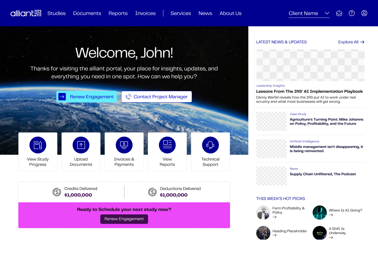
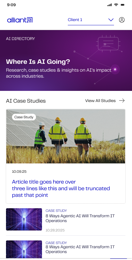
Now it runs across every software product we use.
The client portal and all our internal tools run on v2's colors, components, and guidelines today, creating one unified, upgraded brand.
 Designs modified · NDA
The client portal home, rebuilt on v2.
 Designs modified · NDA
The studies directory, on v2.
Reflections
Standardizing the basics in v1 made the rebrand in v2 far less painful. Because color and type were already a system, the new brand was a change at the system level, not a rebuild of every screen.
Next is v3: a documented spacing scale, elevation tokens, and a contribution model so other designers and engineers can add to the system, not just pull from it.
Credits
- Founding Designer
- Kavyashree Upendra
- v2 code partner
- Front-end full-stack engineer (in-house)
Available under NDA
The full system audit, Figma component library, token architecture, and product screens are available on request.
Request NDA access