This case study is about one question: how do you get a product to answer for itself, so customers stop needing customer service? Over a year and four releases, I turned an audit into a roadmap and designed against it.
Role
Product Design Lead
Timeline
May 2025 to Present
Client
AmeriGas Propane (UGI)
Scope
UX strategy · Role management · Native mobile · Website refresh
Problem
How could the portal do more, so customer service could do less?
The work started with an audit of the customer portal to answer that question: what to recommend, what changes belonged in the roadmap, and where the team should start.
Solution
An opportunity roadmap, sequenced by call volume.
I started with the portal customers were already using, mapped every opportunity back to the moment that should have answered it, ranked them against trailing-twelve-month call data, and sequenced them into three phases the team could act on.
Impact
One audit became four releases.
4releases owned end to end
3phased approach across their strategic planning
1stnative app, July 2026
Context
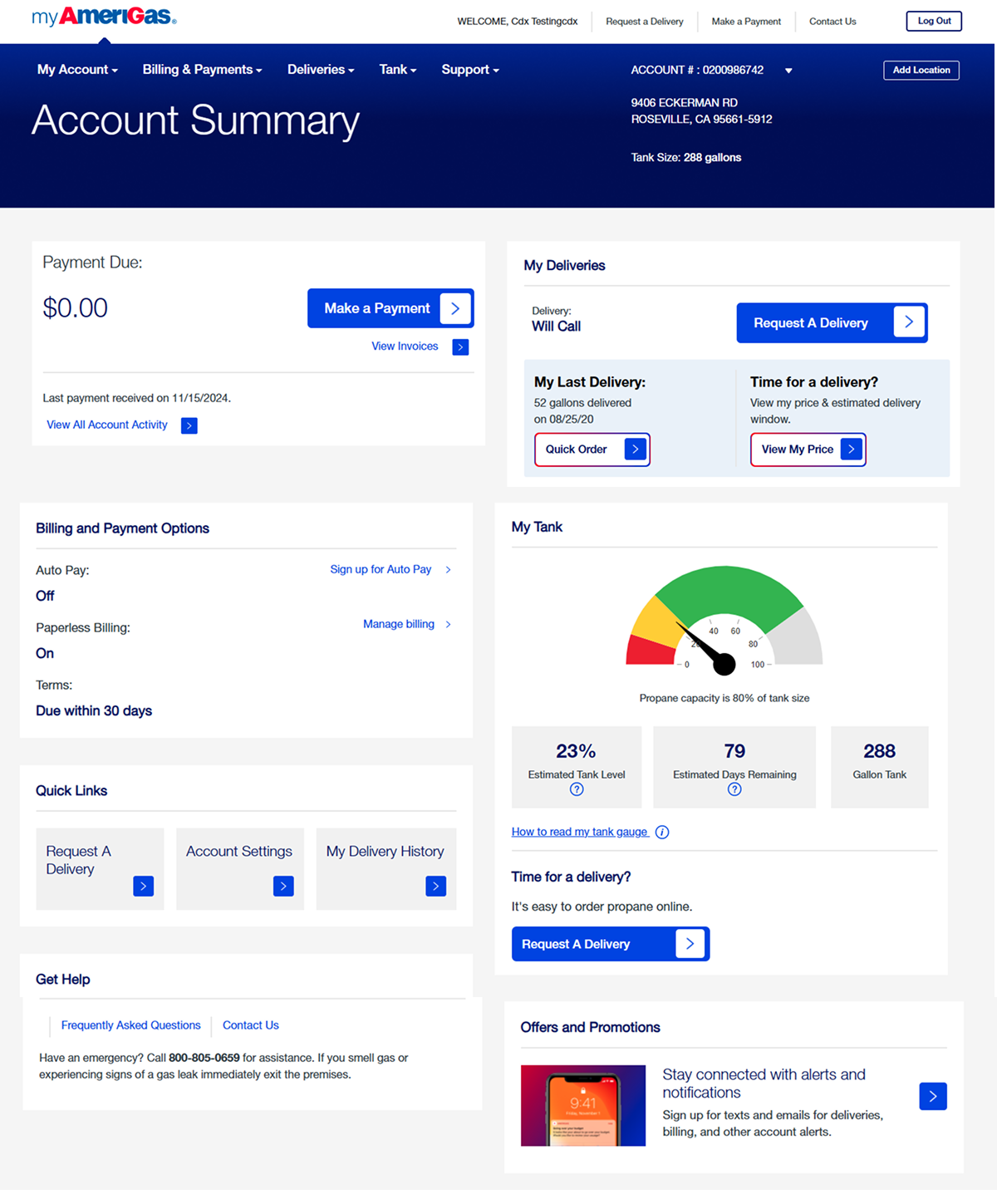
What is myamerigas?
AmeriGas is the nation's largest retail propane distributor. myamerigas is a self-service customer portal. The primary user is a residential homeowner tracking propane usage and scheduling deliveries. The smaller segment is the commercial customer.
Under NDA
Problem framing
Every unanswered question becomes a support call.
That phone call is the design problem.
Release 1
Strategy
Anchoring the work in the data we had.
A trailing-twelve-month inventory of support call topics with transcripts of what customers said when they called. Web analytics across the portal (which pages were used, which were abandoned). A customer survey with the end users. Stakeholder working sessions with AmeriGas's design experience team.
I synthesized all of it into the user model that shaped this strategic roadmap.
Out of all the personas we developed, these are the three the design had to hold to make the decisions in this case study.
The Opportunity Roadmap
The Release 1 deliverable was a phased roadmap, anchored by the call data. Every opportunity was ranked against the research we had and assigned to one of three phases:
Quick Wins
Improvements achievable within the current design system, focused on the highest-volume moments.
Next Phase
Comprehensive redesigns that build on the Quick Wins foundation.
Full Redesign
A reimagined, consistent portal experience across the entire surface, dependent on backend modifications.
The top of the roadmap was where the calls were heaviest: delivery scheduling, billing inquiries, account management. Sequencing came from backend constraints and level of effort. Delivery scheduling and tracking, for example, depended on data the platform couldn't yet surface. Those went into Full Redesign.
A framework view of the Opportunity Matrix. Each bubble is one self-service opportunity, sized to its support call volume tier and placed in its recommended implementation phase. Exact case volumes are withheld and case names modified under NDA.
Behind the roadmap was a multi-section recommendations document. Every opportunity paired with a Quick Win, a Next Phase, and a Full Redesign option, each carrying the actual design changes worked out for that section. Those designs are covered by NDA. Parts of them are shown as modified examples in the deck below.
DESIGN RECOMMENDATIONS
Three implementation phases for AmeriGas's highest-impact customer experience opportunities.
Quick WinsNext PhaseFull Redesign
DESIGN RECOMMENDATIONS · 01 DELIVERY
The highest-volume opportunities.
The design changes we recommended to AmeriGas for the delivery experience.
Delivery Status Tracking. Dashboard visibility, status tags, FAQ for delay context.
Delivery Scheduling Process. Tank-low banner, price confirmation in the flow, abandonment safeguards.
Delivery Method Change. Will Call to Auto-delivery toggle, pause and suspend visibility.
Delivery Modification & Cancellation. Direct cancel with reason capture, priority alignment.
Tank Alerts & Communication. Combined tank and delivery interface, notification preferences.
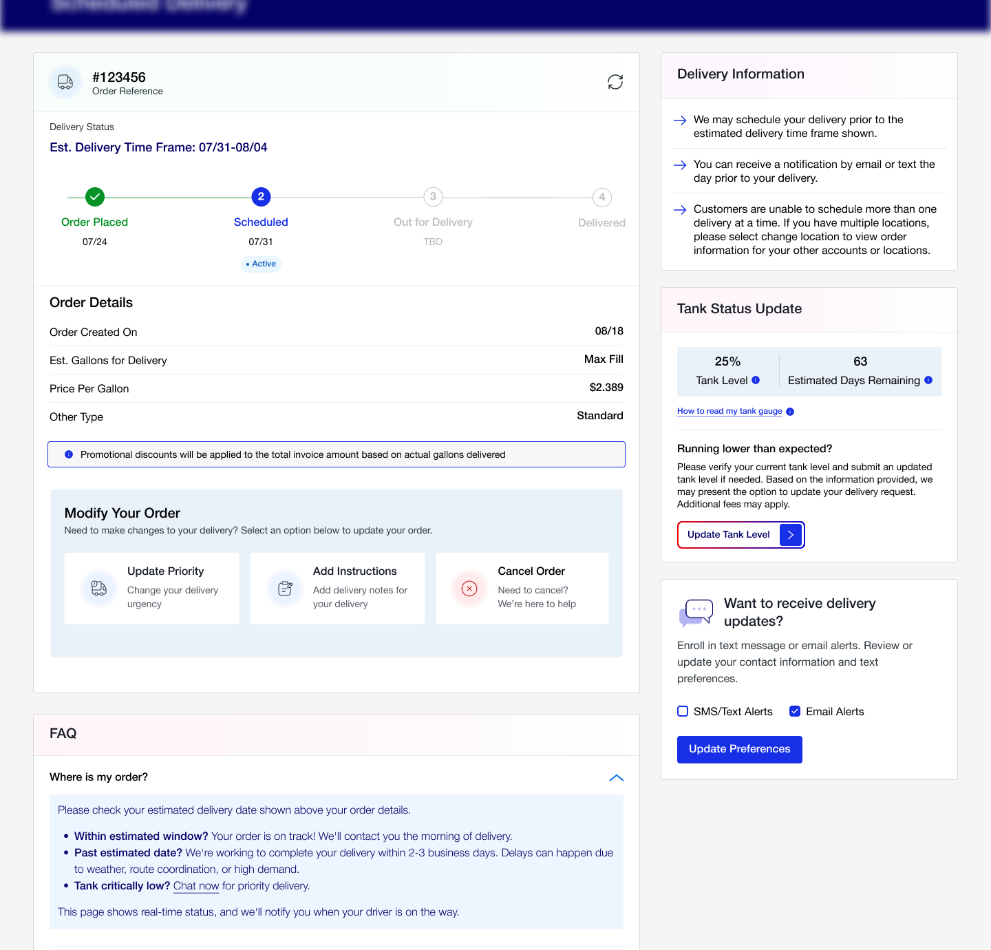
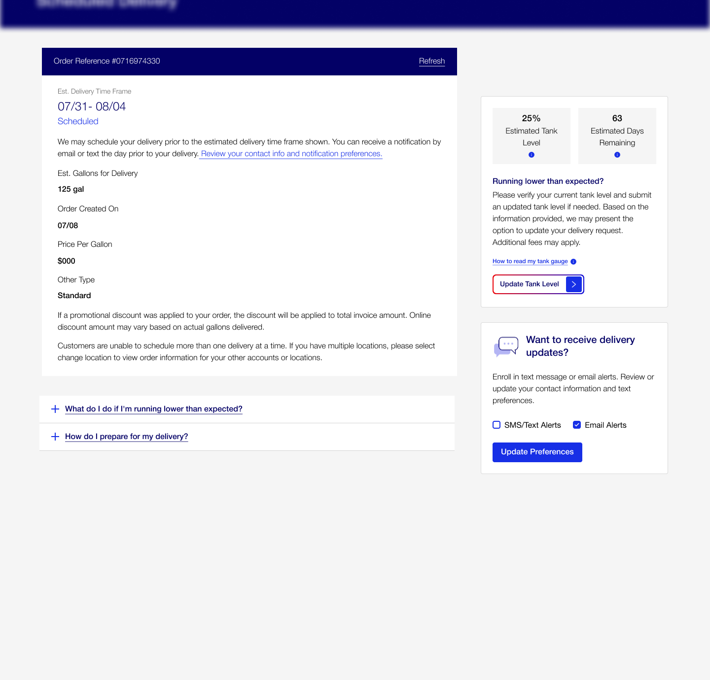
DESIGN EXAMPLE · 01 DELIVERY
What the delivery recommendations looked like.
Screens modified, part of the quick win and full redesign.
Quick Win
Full Redesign · drag to compare
NowRedesign
⇆
DESIGN RECOMMENDATIONS · 02 BILLING & ACCOUNT
Invoice clarity, dispute friction, payment flows.
The design changes we recommended to AmeriGas for billing.
Billing Disputes. Replace dispute form with chat redirect on the dispute link.
Billing Inquiries. Regroup billing items for visibility, line-item tooltips for invoice comprehension.
Account Profile. Modified account screens for clearer visibility into the user's profile section.
DESIGN EXAMPLE · 02 BILLING
What the billing recommendations looked like.
Screens modified, part of the quick win and full redesign.
Quick Win · redirect to chat
Full Redesign · dispute management
DESIGN EXAMPLE · 03 ACCOUNT SUMMARY
What the account summary redesign looked like.
Screens modified, part of the full redesign.
Full Redesign · account overview
CLIENT FEEDBACK
Recommendation. Feedback. Response.
Client feedback
“We don’t have the data to surface real-time delivery status.”
→
Our response
An FAQ pattern explaining the general reasons for a delay, plus a delivery range drawn from historical data when one happens.
1 / 7
A section-by-section view of the recommendations deck. Each opportunity carried a Quick Win, Next Phase, and Full Redesign option, paired with user benefit, engineering dependency, and priority rationale. Full deck and the complete client feedback dialog available under NDA.
Release 2
Role Management
One login per account.
myamerigas was built on a one-login-per-SAP-account model. For a single home with one person managing it, that's the right model. But plenty of customers don't fit that shape, from a homeowner with a vacation property to a team managing buildings across states.
The product couldn't scale for the different types of users using it.
The structural gap before and after Role Management: one account holds many users, each scoped by role and location.
What I designed.
Three interconnected systems.
A role and location permission model
An Online Account Admin role with the authority to invite child users, assign capabilities, and grant access by location. Five capability roles sit underneath:
Billing & PaymentDeliveryHead/Branch OfficeAll User AccessAdmin
Billing users manage invoices. Delivery users request and track. Admin users manage the team. The role structure mirrors how a real account divides the work, whether that's a household with a few properties or an organization with many sites.
A framework view of the role model.
An admin interface with two mental models
Operations managers and property managers think about the same data differently. An ops manager thinks "who has access to what." A property manager thinks "who's responsible for this building."
Forcing one mental model on both audiences was the wrong call. I built a toggle: View by User or View by Location. Same underlying permissions data, two different information architectures.
UserLocation
Billy Byers
All sites (8)
AdminBillingDelivery
Sarah Johnson
2 sites
Billing
Emily Chen
3 sites
Delivery
UserLocation
Northeast
Sarah J., Dana W.
BillingAdmin
Gulf Coast
Maria R.
BillingDelivery
Midwest
James O., Dana W.
Delivery
This supports both: the same permissions layer renders as View by User for the ops manager who thinks "who has access," and View by Location for the property manager who thinks "who runs this site." The user research told me both were real.
A child-user invite and registration flow
The invite flow. The validation step in the middle is the one doing the real work: a ZIP-or-account check adds a second factor for an account that authorizes deliveries and payments, without the SSO infrastructure the platform didn't have.
The detail I'm proudest of
An admin can't be deleted while child users exist underneath them. The system requires admin transfer before deletion.
It's the kind of edge case that breaks accounts in production if you skip it.
What shipped
5capability roles defined under a single admin model
2mental models supported by a single permissions data layer (View by User and View by Location)
1previously unsupported pattern (multi-user, multi-property accounts) now has a working architecture
Release 3
Mobile App
AmeriGas had no native app.
The data showed more of myamerigas's traffic coming from mobile than from desktop. Customers were already managing propane from their phones, tank levels, delivery requests, payments, on a responsive site that worked but was never built for a phone. That gap is what prompted a native app.
Built phone-first for the customers already managing propane on mobile.
Two design decisions worth surfacing
Information density
myamerigas on desktop is a dashboard. Multiple cards, multiple data points, multiple actions visible at once. On mobile, that's not navigable.
I had to decide which data is decision-driving on a phone and which is reference. Tank level and delivery status are decision-driving (do I need to order?). Account activity history is reference (let users dig if they want, but don't make it the first screen).
The state-based CTA
The home screen tied delivery and tank status together, with a dynamic CTA that surfaces the action each state calls for:
Tank low → "Request a delivery"
Tank full → "View delivery schedule"
Auto delivery active → "View next delivery"
Same screen, different priority based on state. The screen earns its place by being predictive, not passive.
The home screen leads with tank level and one primary action. The action is predictive, not passive: it reads the tank state and offers the next decision the customer is most likely there to make.
SHIPPING JULY 2026
The full story, screens and design decisions, lands in a dedicated mobile case study, coming soon.
Release 4
Website Refresh
In progress.
The current release is the AmeriGas marketing website: the public-facing site that introduces propane services, supports signups, and helps existing customers find the portal.
Different surface from the customer product. Same end users.
IN PROGRESS
Website work is shipping through 2026. I'll add it here as it goes live.
Reflection
What I took from a year of myamerigas
01
Multi-release ownership compounds.
Coming into Release 1, I expected the strategy to be the work. It turned out to be the foundation for Role Management, for the mobile app, for the marketing site, for everything still to come. Owning a product means accumulating decisions across releases.
02
Strategy and craft reinforce each other.
The roadmap I built in Release 1 only earned its weight because the craft in Release 2 lived up to it. The craft in Release 2 only earned its weight because the strategy made the case for it. Either one without the other would have been weaker.
03
User research is the loop I want to close.
Across these four releases I built the user model from secondary data, stakeholder sessions, and analytics. It's good work, and there's a ceiling on what good work can be without direct user access. I'd like to have more end-user reviews to see the impact of the findings and iterate on that.
Credits
Design Lead
Kavyashree Upendra
Confidential
This work was done under NDA. Screens and specifics are kept out of the public case study. Reach out if you'd like to see more.