Redesigning a checkout to win back the 68.8% who abandoned it.
Forever 21 · self-directed study
Concept, not shippedForever 21's mobile cart lost nearly seven in ten shoppers. I ran a heuristic teardown of the checkout, found where buying intent broke, and rebuilt the flow around the three things research says actually drive people to quit: surprise costs, forced accounts, and a checkout that asks too much.
- Role
- UX/UI Designer, self-directed
- Scope
- Heuristic teardown · checkout redesign
- Team
- Individual
- Status
- Concept study, not shipped
Problem
A 68.8% cart abandonment rate.
The mobile checkout asked for an account before it gave anything back, hid shipping cost until the final screen, and ran a long multi-step form. Each one is a documented reason shoppers walk away from a cart they meant to buy.
Solution
A checkout rebuilt around why people actually leave.
Guest checkout at the front. Every cost, shipping, tax, and total savings, shown before the final step. A shorter form. Trust and support cues placed at the moment of payment, where last-second doubt kills the sale.
Expected impact
Benchmark-based, not measured
Figures are industry benchmarks from the Baymard Institute, framed as expected lift. This was a self-directed concept, so none of these are measured results from a live test.
What Forever 21 is, and why the cart mattered
Forever 21 is a US fast-fashion retailer selling trend-led, low-price clothing to a mostly 20 to 35 audience. That audience shops on a phone. When a cart leaks 68.8% on the one surface where money changes hands, it is the most expensive problem the business has, because the shopper has already decided to buy. The work was not to attract more shoppers. It was to stop losing the ones who already wanted to pay.
Where the checkout lost people
I walked the existing app screen by screen against Nielsen's usability heuristics. I was not looking for visual taste. I was looking for the exact moments a shopper who wanted to buy hit friction and left. Three gates kept showing up, and they line up almost exactly with the most common abandonment reasons in checkout research.
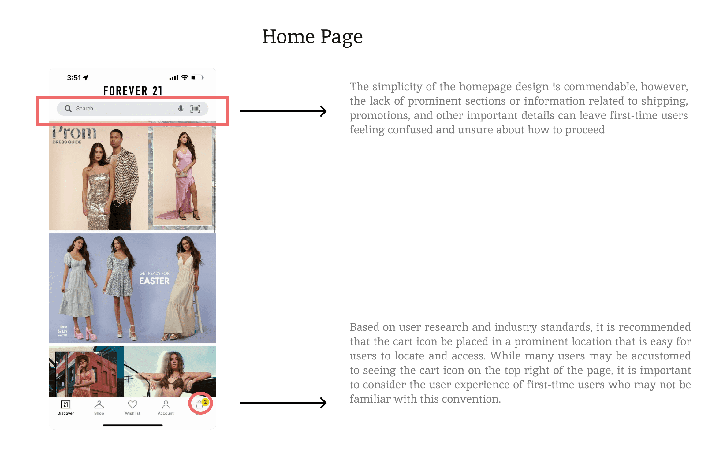
One screen from the heuristic walkthrough of the existing checkout. I annotated each usability issue against Nielsen's heuristics before proposing a single change.
I cut ten ideas down to four moves, ranked by how much abandonment each one removes.
The easy version of this project is a list of ten checkout tips. The useful version is a priority order. I mapped each idea to a documented abandonment driver and led with the ones that move the most volume, so an engineering team could ship in impact order instead of all at once.
Let people check out as guests, first.
Forced account creation is the second-biggest reason carts get abandoned. The original flow demanded it before payment. I made guest checkout the default path at the front of the flow and moved the account offer to after purchase, framed as "save your details for next time" rather than a wall. The shopper reaches pay without handing over an identity first.
Guest checkout lowers abandonment by about 14% against mandatory registration. It was the cheapest high-impact change available.
Show every cost before the last step.
Surprise shipping and fees are the single biggest reason carts are abandoned. The original revealed them only at the final screen, after the shopper had invested effort. I surfaced shipping, tax, and a running total on the product and cart screens, and added a total-savings line so the shopper sees what they keep, not just what they pay. No number appears for the first time at the moment of commitment.
Shorten the path to pay, and steady the nerves at payment.
The original spread a small amount of information across many steps. I collapsed the form, cut optional fields, and made the primary action obvious on every screen. At the payment step, where last-second doubt does the most damage, I added a clear secure-payment cue and a one-tap support entry, so a hesitating shopper gets reassurance instead of a reason to close the tab.
Give the not-ready-yet shopper somewhere to go.
A large share of abandonment is people who were just browsing. Fighting that is a losing game, so I gave intent a place to wait: a wishlist to save items, promo codes and time-limited offers to nudge a decision, and a clear return policy to lower the risk of buying now. A shopper who is not ready leaves with a reason to come back instead of bouncing for good.
The redesigned checkout
The four decisions resolved into a mobile-first flow: guest checkout up front, costs visible from the cart screen, a shortened form, and trust, savings, and support cues placed where the data said they were needed.

The redesigned checkout flow. Costs are visible from the cart, guest checkout leads, and the payment step carries the trust and support cues.
What this would be expected to move, and how I'd prove it
This was a self-directed concept, so I will not claim a measured result. What I can do is tie each decision to a documented benchmark, and name the test I would run to confirm it. Honest beats impressive.
How I would validate it: A/B test the guest-checkout-first flow against forced login, measuring checkout completion and time-to-pay; instrument the funnel to watch where drop-off actually lands; and run moderated usability sessions on the cost-transparency screens to confirm the running total reads as reassurance rather than sticker shock.
What I'd do differently now
This is early work, and keeping it here is deliberate, because it shows how my thinking has changed. The instinct was right: fix the checkout where it actually leaks, and prioritize by impact instead of shipping ten changes at once. What I would add today is rigor. I would start from real session data and funnel analytics rather than heuristics alone, validate the redesign with usability testing before calling it done, and frame the outcome as a hypothesis to test, not a number to claim.
The judgment held up. The proof is what I would build in now.
Credits
- Designer
- Kavyashree Upendra, self-directed
- Methods
- Heuristic evaluation, competitive teardown, paper prototyping
- Tools
- Figma, Balsamiq
- Status
- Concept study, not shipped or tested
A note on the numbers
Every percentage on this page is either Forever 21's reported abandonment rate or an industry benchmark from the Baymard Institute, framed as expected lift. None are measured results from a live test, because this concept was never shipped. I would rather show the reasoning than borrow a result I did not earn.
See the Baymard checkout research